One Space, Six Designs
- Atria Atelier
- Apr 15
- 2 min read

Updated: Apr 24

The layout of a space defines how it functions. But what defines how it feels?
Materials. Colour. Light.
Here’s how the same layout can create completely different moods — simply by changing what goes into it.

Soft Tones + Subtle Textures
Materials: Light stone, soft fabrics, minimal wood.
Colour Palette: Ivory, beige, soft whites
What it does: Creates a space that feels serene, light, and elevated
Low contrast creates visual continuity
Texture adds richness without heaviness
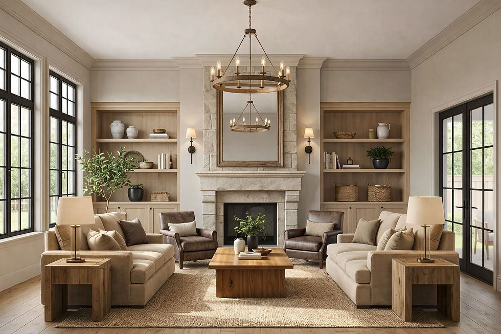
Natural Textures + Layered Neutrals
Materials: Wood, stone, linen, woven elements.
Colour Palette: Beige, taupe, off-white, soft browns.
What it does: Creates a space that feels warm, grounded, and inviting
Texture replaces the need for bold colour
Natural materials add authenticity and depth

Light Base + Minimal Contrast + Muted Tones
Materials: Smooth painted surfaces, soft fabrics.
Colour Palette: Whites, soft greys, muted greens.
What it does: Creates a space that feels calm, open, and effortless
Reduced contrast lowers visual noise
Light tones reflect more, making the space feel larger

Warm Wood + Soft Neutrals + Deep Accents
Materials: Wood, fabric upholstery, subtle metal accents.
Colour Palette: Beige, cream, warm browns, deep accent tones.
What it does: Creates a space that feels refined, balanced, and timeless
Warm undertones add comfort and familiarity
Accents introduce depth without overwhelming

Dark Materials + Matte Finishes
Materials: Dark wood, metal, matte surfaces.
Colour Palette: Charcoal, deep brown, muted tones.
What it does: Creates a space that feels bold, intimate, and strong
Dark surfaces absorb light, creating enclosure
Controlled contrast adds intensity without chaos

Deep Tones + Warm Lighting
Materials: Dark wood, rich finishes, layered fabrics.
Colour Palette: Deep browns, charcoal, warm amber light.
What it does: Creates a space that feels dramatic, immersive, and luxurious
Warm lighting enhances depth and shadow
Dark palettes heighten emotional intensity
The Core Principle
Colour creates mood
Materials create depth
Light brings it all together.
Comments